

What Do the Different Colored Crosswalks in Portland, Maine Mean?
There's quite the debate going on.
So, it's easy to figure out what the rainbow crosswalks meant in June - gay pride. Cute and many cities in Maine celebrated this way.
But what's up with the blue crosswalk in Portland?
And if you like blue, then you'll love orange!
I love that Portland is always trying new things. I know the city has had some and is still dealing with growing pains. Find an old Portlander and you'll inevitably hear about how great Portland used to be. I agree in a lot of ways, but I still love this city so much. I also love that Portland really does try. From sprucing up crosswalks to involving Mainers in shaping Portland.
I love a colored crosswalk. Portland said that the orange color 'falls in line with the new branding colors adopted by the @cityportland !' I looked and looked and looked to see what the 'branding colors' were for Portland. I saw no orange, but I did actually find something on the new branding of Portland.
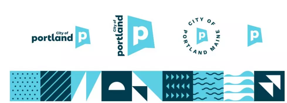
The primary logo colors - Casco navy and Bay light blue - pull from the coastal character of Portland's location. The secondary palette, which is also assigned to City departments, gives a crisp, fresh, bright take on everything the city has to offer. The Resurgam yellow represents hopeful, optimistic, and energetic confidence. The Exchange reddish-orange pulls from the working waterfront and historic brick architecture. The Parks and Promenade teals/green are a nod to the City's open green spaces and a sense of renewal. The added "Island" blue evokes reliability, trust, strength and the City's responsibility to its people. The Monument color brings a subtle neutral tone to balance out the saturation of the palette as a whole.
Okay. Nothing about orange (reddish-orange doesn't count) and I don't care, I still like it.
See the Must-Drive Roads in Every State
Gallery Credit: Sarah Jones
More From Q97.9
